
Most advice about Aquarian vs Evans vs Remo starts with tone. That’s useful, but it misses the key buying question for anyone ordering a custom front head.
A bass drum head with artwork isn’t just part of the kit. It’s part of the band’s presentation. The surface under that logo affects how sharp the lines look, how colors read under stage lights, how clean a white background appears, and how long the design keeps looking professional after load-ins, tune-ups, and transport.
For a custom order, the brand decision should start with the canvas first, sound second. A head can be perfect sonically and still be the wrong choice for a detailed logo, a dark photographic print, or a clean minimalist mark that needs crisp edges. That’s where the Aquarian vs Evans vs Remo conversation gets more practical.
Here’s the short version before the deeper breakdown:
| Brand | Common visual character for custom print | Surface feel to consider | Best fit for |
|---|---|---|---|
| Aquarian | Often reads smooth and clean for bold graphics | Good option when a design needs a polished, even look | Bands wanting strong color presence and a controlled visual finish |
| Evans | Often suits sharp, modern artwork and high-contrast layouts | Useful when clarity and attack matter both visually and sonically | Modern branding, punchier presentation, cleaner geometric art |
| Remo | Often feels more open and classic depending on model and finish | Clear versions can print cleanly, textured versions change the look | Traditional logos, vintage-inspired art, familiar resonant head choices |
The point isn’t that one brand wins across the board. It doesn’t. The right choice depends on what’s being printed, how the drum is used, and whether the head needs to prioritize color pop, subtle texture, or long-term visual neatness on stage.
Your Bass Drum Head Is More Than a Sound It Is a Canvas
Most drummers shopping for a front head still hear the same advice. Pick the sound first, then worry about the logo. For a custom bass drum head, that order is backwards.
A printed head sits at the front of the kit where the audience, photographer, club staff, and promoter all see it first. If the artwork looks soft, the whites look dingy, or the surface fights the print, the whole kit can look less finished than it should. That matters whether the band is playing a club date, a church stage, a school concert, or a filmed session.
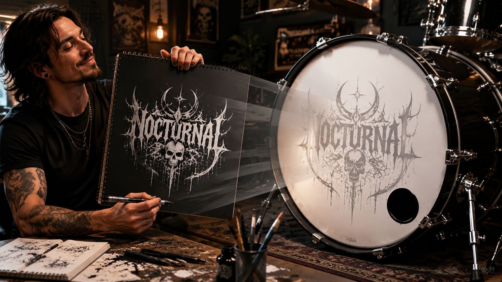
A custom head works like signage. The shell, hoops, and hardware frame it, but the head itself carries the message. That’s why musicians looking through inspiration galleries should view custom drum head designs with two questions in mind: what looks good as artwork, and what still looks good after repeated use?
Why the canvas matters before the logo
Two designs can be identical on screen and look different once printed on different head surfaces. Fine line art needs edge definition. Heavy black logos need an even base so they don’t look muddy. Vintage artwork sometimes benefits from a slightly softer visual character instead of a stark, glossy result.
That’s the practical side of the Aquarian vs Evans vs Remo decision. It isn’t only about attack, warmth, or openness. It’s also about whether the head gives the artwork the right visual behavior.
A front head should match the band’s identity the same way a backdrop, merch table, or stage scrim does. If the visual finish is wrong, the whole brand presentation feels off.
A good custom head solves two jobs at once
A resonant bass drum head still needs to function as a drum head. But a custom order adds another job. It has to present artwork clearly under stage light, room light, and camera flash.
That means buyers should judge the head on a different set of priorities:
- Surface character: Smooth surfaces usually favor cleaner detail and stronger apparent sharpness.
- Base appearance: The head’s white, off-white, clear, or textured look changes how artwork reads.
- Wear pattern: A head that stays visually consistent keeps the design looking intentional instead of tired.
- Use case: Touring, backline, rehearsal rooms, and one-off events all stress a head differently.
The wrong choice usually fails visually first
Most players notice visual disappointment before they notice a subtle tonal mismatch. The logo doesn’t feel crisp enough. The art looks flatter than expected. A textured finish softens small elements. A port cuts through the wrong part of the design. Those are buying mistakes, not performance mistakes.
That’s why this comparison treats Aquarian vs Evans vs Remo as a print decision. Sound still matters, but the buyer ordering a custom head needs to choose the surface that makes the band look organized, intentional, and stage-ready.
How Drum Head Construction Affects Your Custom Print
The print quality on a bass drum head starts before any artwork file is uploaded. It starts with the head’s construction.
Modern synthetic drumheads trace back to the brands that shaped the category. Remo and Evans are widely described as the two brands that pioneered modern synthetic drumheads in the 1950s, while Aquarian is commonly positioned as the newer major brand. One industry summary notes that Remo’s Ambassador, released in 1958, originally used a 7.5 mil ply bonded to a 3 mil ply, a design that became a foundational reference in the market, as outlined in this industry history of major drumhead manufacturers.

Surface finish changes the way art reads
The biggest print variable is finish. A smooth clear or smooth white head usually gives artwork the cleanest edge definition. Coated and textured heads can still look great, but they change the result. Small type, thin lines, and tight geometric details usually benefit from a more even surface.
Three common finish behaviors matter most:
- Smooth and clear heads: Best when a design needs sharp outlines, saturated color, or photo-style detail.
- Coated heads: More texture under the print can soften the look slightly and make the final graphic feel less clinical.
- Specialty textured finishes: Good when the design wants a vintage or organic feel, but not always ideal for tiny details.
Practical rule: The more detailed the artwork, the more the buyer should lean toward a cleaner, less textured print surface.
Base color affects color accuracy
A custom file doesn’t print in a vacuum. It prints onto the head’s existing base color and finish. That means the same logo can look cooler, warmer, brighter, or more subdued depending on the head underneath it.
This matters most when the design includes:
- Bright brand colors that need to stay vivid
- Soft neutrals that can shift warmer on cream-toned surfaces
- Black-heavy layouts where contrast is everything
- Photographic or gradient art that depends on subtle transitions
A brilliant white base tends to feel more modern and direct. A warmer white or vintage-style surface can flatter retro graphics, hand-drawn marks, and roots-oriented branding. Neither is universally better. The head should match the artwork style.
Ply and build still matter visually
For custom printing, ply choice isn’t just a sound issue. It also affects how the head handles dents, flex, repeated mounting, and transport. A head that stays physically stable is easier to keep looking clean. A head that gets marked up, distorted, or fatigued can make the artwork look older faster.
That’s one reason buyers should think beyond brand names and ask what kind of use the head will see. A studio logo head that lives in cases between sessions has different needs than a front head going in and out of vans every weekend.
For buyers comparing process options, it also helps to understand the difference between file application methods before ordering. This guide on choosing custom drum head printing methods is a useful next step because the print process and the head surface work together.
A Print Focused Comparison of Aquarian Evans and Remo
Most comparisons stop at tonal character. That leaves out the part custom-head buyers have to live with on stage: how the head behaves as a printed object.
That gap shows up often in player discussions. A major underserved angle is fit and failure-mode differences in real-world use, not just sound. Many comparisons reduce these brands to brightness, warmth, or durability, but they rarely answer the practical questions gigging drummers care about, including consistency across batches, coating wear, and whether heads remain usable after repeated tuning changes, as discussed in this video discussion about real-world comparison gaps.

Quick comparison for custom print buyers
| Brand | Surface impression for printed art | Color behavior | Detail behavior | Best visual use |
|---|---|---|---|---|
| Aquarian | Often chosen when a clean, controlled surface is the priority | Often favorable for bold color and solid fills | Strong for logos and defined shapes | Polished band identity, modern artwork, clean front-of-kit branding |
| Evans | Often feels precise and contemporary depending on model | Works well for contrast-heavy designs | Good fit for sharper graphics and modern layouts | Punchy visual identity, strong lines, cleaner aggressive branding |
| Remo | Broad range from smooth clear to more textured classic finishes | Depends heavily on the specific finish selected | Clear options suit detail better than textured ones | Classic logos, retro art direction, familiar open front-head look |
Aquarian for clean visual control
Aquarian often appeals to buyers who care about a tidy, deliberate front-of-kit appearance. For custom printing, that usually translates well to bold graphics, solid shapes, and logos that need a smooth visual presentation.
A practical strength here is predictability of look. For a band ordering a head with a centered emblem, a dark outer field, or a design that relies on even color rather than intentional texture, that more controlled visual character can be a strong fit.
Aquarian usually makes sense when the artwork needs to look designed, not distressed.
Possible trade-off: if the buyer wants a more open, old-school visual personality, too polished a surface can feel slightly formal. That isn’t a defect. It just means the art direction and the head choice need to agree.
Evans for sharper modern branding
Evans often fits a head design that wants clarity, attack, and modern contrast. This makes sense for contemporary logos, angular symbols, minimal black-and-white layouts, and branding that leans more polished than vintage.
For many custom orders, Evans is an easy visual match when the band identity already has a crisp look. Think straight lines, sans serif type, geometric spacing, and cleaner negative space. That visual language tends to pair naturally with a head that doesn’t fight sharp presentation.
A buyer should still pay attention to finish choice. A smooth surface and a frosted or coated surface won’t present the same artwork the same way, even under the same brand name.
Remo for familiar and flexible canvas choices
Remo remains a familiar reference point for a lot of drummers, and that matters because many buyers already understand roughly what kind of visual and sonic personality they’re getting from common front-head options.
For custom print use, Remo can go in two distinct directions:
- Clear or smoother options can support cleaner graphic reproduction
- Coated or textured options can make artwork feel more organic or classic
- Vintage-style visual concepts often sit naturally on surfaces that don’t look too clinical
The key with Remo is not to assume one finish stands in for the whole brand. A clean logo on a clear head and a retro mark on a textured head can both work, but they produce different stage impressions.
A lot of buyers don’t need a dramatic statement. They need a front head that looks familiar, professional, and easy to integrate into an existing kit aesthetic. That’s where Remo often fits.
What works and what doesn’t for artwork durability
For custom art, the failure point usually isn’t “does the logo exist on the head?” It’s whether the head still looks good after transport, mounting, cleaning, and tuning.
What usually works:
- Artwork scaled to the head finish: Fine line work on smoother surfaces, broader shapes on more textured ones
- Port placement planned with the graphic: Don’t cut through the logo’s most important visual area
- Designs with strong contrast: They stay legible under uneven lighting
What usually doesn’t:
- Tiny details on textured surfaces
- Cream or warm-tone artwork assumptions on very bright bases
- Crowded layouts that leave no room for port hardware or visual breathing room
Buyers who want more model-specific help can also review these tips for custom bass drum heads before finalizing the order.
Matching Your Sound Profile to Your Visual Brand
A custom bass drum head doesn’t live in isolation. The logo, the shell finish, the stage clothes, the genre, and the kick sound all create one impression. That’s why the Aquarian vs Evans vs Remo choice works better when the sound profile and the visual brand support each other.
Aquarian, Evans, and Remo are commonly differentiated by a tonal progression. Evans is typically described as brighter, Aquarian as darker and warmer, and Remo as more open in character, which matters when matching a bass drum head to a mix-heavy live rig or a controlled studio sound, as noted in this player comparison discussion of tonal differences.

When the visual identity is modern and aggressive
A band using sharp vector artwork, hard-edged type, minimal palettes, and a more contemporary stage look often wants the entire presentation to feel tight. In that context, a brighter, more cutting identity often aligns naturally with Evans.
That doesn’t mean the head should look sterile. It means the sound and the front-head art point in the same direction. If the logo says modern, the kick shouldn’t suggest soft vintage character unless that contrast is intentional.
When the visual identity is warm and rooted
Some bands want the opposite. Their artwork may use distressed textures, hand-drawn marks, muted colors, or vintage references. In that case, Aquarian often fits the broader brand picture because the darker and warmer tonal reputation complements that softer visual language.
This is especially useful when the goal isn’t maximum visual sharpness, but a front head that feels substantial and grounded. A roots, country, Americana, blues, or retro rock project often benefits from that cohesion.
When the visual identity needs openness and familiarity
Remo often lands well when the band wants a classic presentation that doesn’t force the look too far in either direction. If the artwork is traditional, the shell pack is already dialed in, and the player wants a head that feels recognizable both visually and musically, that combination can be easy to work with.
- Use a brighter visual system when the band wants a clean, direct, hard-hitting stage presence
- Use a warmer visual system when the branding leans handcrafted, vintage, or earthy
- Use a more open visual system when the project wants flexibility and a familiar classic feel
The best custom head doesn’t just print the logo correctly. It makes the band look like the sound and the artwork belong to the same group.
Designing Your Head Practical and Technical Tips
A strong bass drum design usually fails for visual reasons, not printing reasons. The head gets ordered with artwork that is too small, the port cuts through the name, or the file looks good on a laptop and weak under stage lights. Good results come from treating the head like a round sign with hardware, curvature, and viewing distance built into the layout from the start.

Place the mic port like part of the design
The port is part of the composition whether you plan for it or not.
I see this mistake constantly in submitted files. A band centers the logo, adds fine text near the bottom, then asks for a port in the lower right. Now the artwork has a hole punched through the area that carried the balance of the design. That is avoidable.
A few layouts hold up well on stage:
- Shift the main mark upward when the port sits low
- Keep small text away from the port side so nothing important gets clipped
- Use the port as a visual anchor with the artwork shaped around it
- Leave extra clearance near the cut area because the eye already reads that zone as interrupted
If the head needs to read fast from the crowd, reserve the lower area for function and let the center do the branding work.
Choose front or batter based on visibility and wear
For most buyers, the front resonant head is the right print surface. It faces the audience, photographs well, and keeps the artwork away from repeated beater impact, stick contact, and setup abrasion.
Batter-side printing has niche uses. It can work for display kits, content shoots, or specialty builds where the visual is aimed at the player or camera angle. It also wears sooner. If the goal is a clean, professional band look over time, the front head gives the design a much better chance to stay sharp.
Build the file for stage distance, not screen distance
Artwork that looks detailed at 100 percent zoom often falls apart from twenty feet away. Fine outlines disappear. Tight spacing fills in. Subtle color differences flatten under colored lights.
Cleaner files print better and read better. That means larger shapes, stronger spacing, fewer tiny effects, and type that can still be understood from the back of the room.
Use these checks before approval:
- Make the main logo large enough to read quickly
- Keep margin near the hoop so the design does not feel crowded at the edge
- Account for the head color and finish because the print will not sit on the same white point in every case
- Mock up the port and hardware first instead of treating them as last-minute add-ons
If you are still refining the art, this guide can help you create your best drum head look.
One practical option for this process is Custom Bass Drum Head, which lets customers upload artwork, preview placement in the browser, choose brand head options, and set the mic port position before approval.
Your Final Decision and How to Order
The Aquarian vs Evans vs Remo question gets much easier once the buyer stops asking which brand is “best” and starts asking which brand is the right canvas.
Comparison charts and forum discussions show that drummers often want direct swaps between similar models, but many resources stop at equivalency names instead of translating them into practical choices for batter versus resonant use. That matters because the market is still guided heavily by equivalency rather than standardized testing, as explained in this drumhead equivalency comparison resource.
A simple way to decide
Choose Evans when the custom design needs a more modern visual language. That usually means cleaner lines, stronger contrast, and branding that wants to feel precise on stage.
Choose Aquarian when the artwork needs a polished, controlled look and the overall brand identity leans warm, bold, or substantial rather than airy.
Choose Remo when the buyer wants a familiar reference point, a classic visual feel, or a specific finish that matches a traditional logo style.
What usually leads to the right order
The cleanest buying decisions tend to come from these questions:
- What does the artwork depend on most? Crisp detail, bold color, or textured character?
- Where will the head live? Weekend gigs, studio work, school use, touring, or occasional events?
- Is the port already part of the design plan? If not, the layout probably needs another pass.
- Does the visual tone match the band’s musical identity? If not, the head may still feel wrong after printing.
A buyer doesn’t need perfect technical language to get this right. It’s enough to know whether the priority is sharpness, warmth, openness, durability in use, or a balance of those.
The next move is simple. Pick the brand that matches the artwork style, choose the resonant head if the goal is front-of-kit presentation, plan the port intentionally, and then design and approve your drum head.
A custom front head should do more than carry a logo. It should make the whole kit look organized, professional, and unmistakably yours. If the band is ready to turn artwork into a stage-ready bass drum head, start a design with Custom Bass Drum Head.