The drummer ordering a custom bass drum head usually starts in the same place. There’s a logo on a laptop, a rough sketch in a notes app, or an album graphic that looks strong on screen, but there’s still one big question hanging over it. Will it work once it’s stretched across a kick drum, framed by hoops, lit by stage wash, and seen from the back of the room?
That’s where most custom kick drum art decisions go right or wrong. A design can be technically printable and still fail on stage. It can also be simple, clean, and powerful without feeling boring. The difference comes down to how the artwork is planned, built, proofed, and printed.
The modern custom market exists because the process changed in the mid-2000s. Specialized custom bass drum head services launched commercially around 2006, which marked the shift from manual sticker applications to direct-to-head digital printing. That change turned the bass drum from a functional drum into a true visual centerpiece and made high-resolution custom artwork a practical standard instead of a workaround.
From Idea to Design Crafting Your Kick Drum Identity
A bass drum head is usually the first thing the crowd reads. Before file formats, ports, or proofs, the primary job is deciding what that drum should say about the band, artist, school, or event.
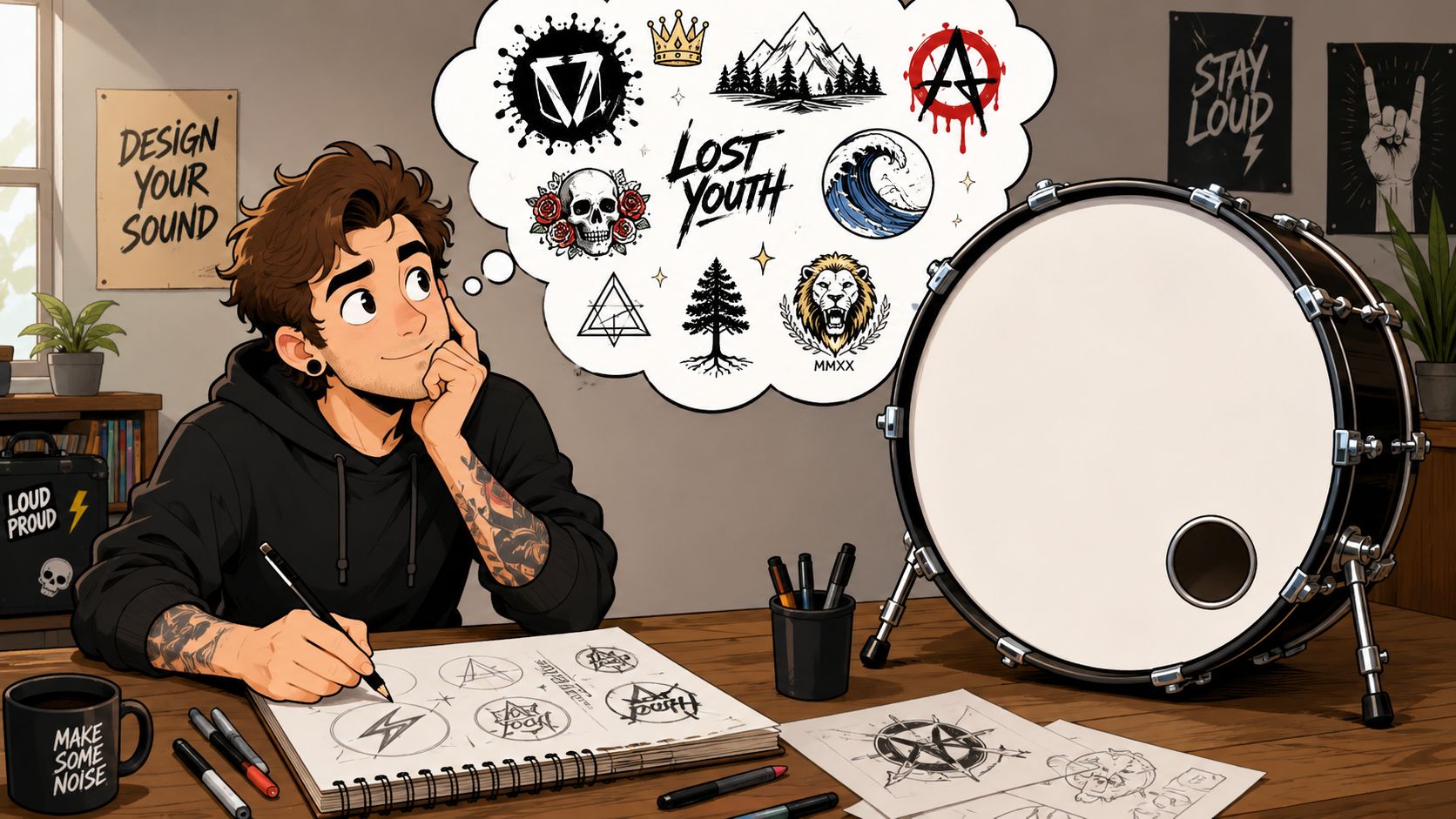
Start with identity, not decoration
The strongest custom kick drum art usually comes from one of a few directions:
- A band logo that already appears on flyers, streaming artwork, or merch
- Album-inspired art adapted into a cleaner, more readable circular layout
- Name-first branding where the band name matters more than illustration
- Abstract visual style that supports a mood, genre, or stage aesthetic
The trap is trying to force a poster design onto a drum head. A rectangle can handle lots of supporting detail. A drum head can’t. It’s circular, partially hidden by the hoop, and often viewed at an angle.
That’s why early concept work matters more than people expect. The drummer who starts with “what should the audience recognize first?” gets to a better result faster than the one who starts with “how much artwork can fit?”
For bands still refining that visual direction, looking through band logo design ideas for drum heads can help narrow the concept before any final art gets uploaded.
A kick drum head works best when it communicates one idea clearly. Name, symbol, or mood. Trying to make it do all three at once usually weakens all three.
Choose where the art lives
One of the first practical decisions is whether the artwork belongs on the front resonant head or the batter head.
The resonant side is the standard choice for a reason. It faces the room, the camera, and the audience. If the goal is branding, stage presence, or a polished live look, that’s the obvious home for the design.
The batter side is more personal. Some drummers like that choice for studio sessions, private setups, or a design meant for the player rather than the crowd. It can be a cool option, but it won’t deliver the same visual payoff in live performance.
Match the concept to the room
A useful way to pressure-test the concept is to ask three quick questions:
-
Will the audience understand it fast?
If the design needs explaining, it’s too complex. -
Does it fit the band’s actual visual world?
A brutal logo, a delicate script, and a watercolor background can all be good individually. Together, they may not belong to the same project. -
Will it still feel right in six months?
Trendy details date quickly. A strong logo or clean symbol usually lasts longer.
Some of the best custom kick drum art isn’t the busiest. It’s the most intentional. A centered logo, a controlled background, and a clear visual hierarchy nearly always beat a cluttered “everything at once” layout.
Perfecting Your Artwork for Flawless Printing
A good concept can still print badly if the file is built wrong. Most print issues don’t come from the printer. They start in the artwork.
Vector for logos, raster for photos
The cleanest way to think about file types is simple. Vector files are math-based paths. Raster files are grids of pixels.
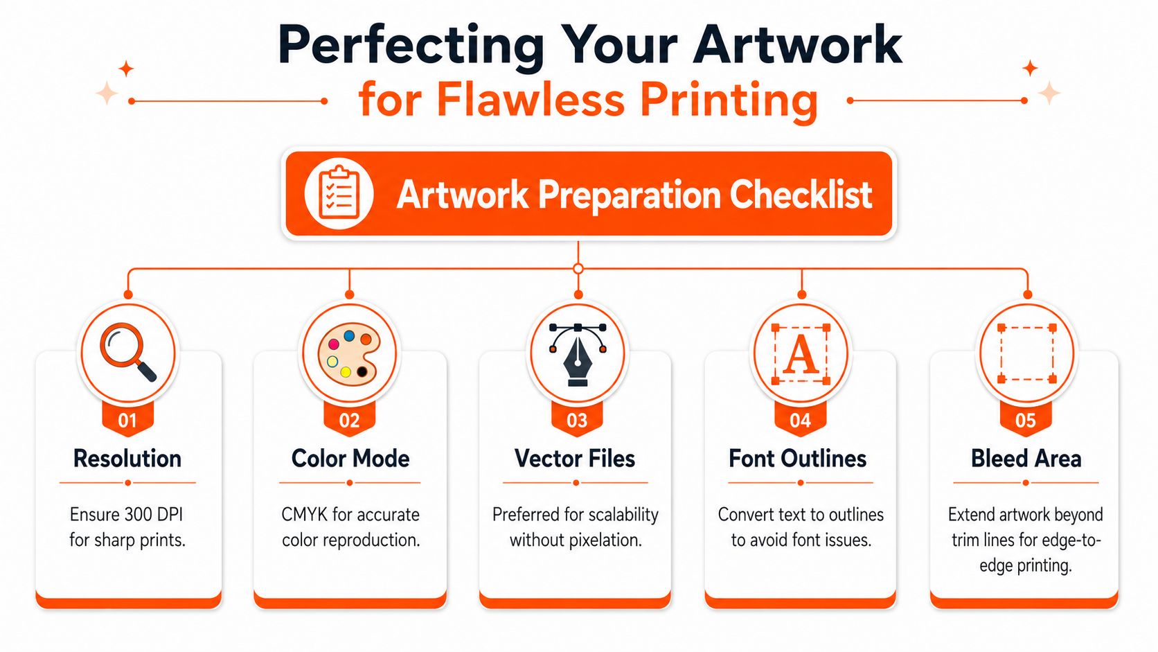
A logo should almost always be vector. Text should too. That’s why SVG and PDF are the preferred formats for logos and lettering. They scale cleanly without soft edges.
Photos, textures, and painted artwork are usually raster. Those can work well, but only if the file is built correctly at final size.
Non-negotiable rule: logos and text should be supplied as vector files, while JPG and PNG artwork must be built at 300 DPI at the final print size, and a 24-inch drum head must be prepared at exactly 24 inches, not enlarged from a smaller file, as outlined in custom drum head artwork specifications.
A common mistake is pulling a logo from social media, dropping it into a layout, and assuming it’ll print clean on a large drum. On screen, it can look fine. At full size, the edges often break down fast.
For more examples of file-ready layouts and design approaches, custom bass drum head graphics examples are useful reference points.
Use the three-zone layout
The best layouts respect how a drum is seen.
A reliable method is the three-zone structure:
| Zone | What goes there | What to avoid |
|---|---|---|
| Outer zone | Background texture, color fields, non-critical design elements | Important text, logo edges, tiny details |
| Middle zone | Main graphics, supporting shapes, larger art elements | Fine typography too close to the hoop |
| Inner zone | Critical logo marks, band name, focal text | Overcrowding with too many elements |
The reason is practical. The hoop and viewing angle can obscure part of the perimeter, so the outside edge isn’t safe space for anything the audience must read.
Check edge quality and legibility separately
Most buyers inspect artwork only one way. They zoom in and admire detail. That’s half the job.
A proper proof check needs two views:
- Zoom in to catch jagged edges, compression, and rough transparency
- Zoom out to see whether the design still reads as a whole
- Look at the center first because that’s usually where recognition happens
- Ignore tiny details unless they still matter when the image is reduced
Zooming in tells whether the file is printable. Zooming out tells whether the design is useful.
Typical file mistakes that ruin a good design
A lot of avoidable issues show up again and again:
- Low-resolution screenshots pulled from websites or social profiles
- Flattened text that looked sharp in one app but can’t be edited later
- Crowded edge placement that puts critical detail where the hoop hides it
- Mismatched source art where one element is crisp and another is visibly soft
The best custom kick drum art doesn’t rely on rescue work at the last minute. It starts with a file that was built for print, at size, with the drum’s circular format in mind.
Placing Your Order Mockups Mic Ports and Final Checks
This is the point where the design stops being an idea and starts becoming a physical drum head. It’s also the stage where small oversights become permanent.
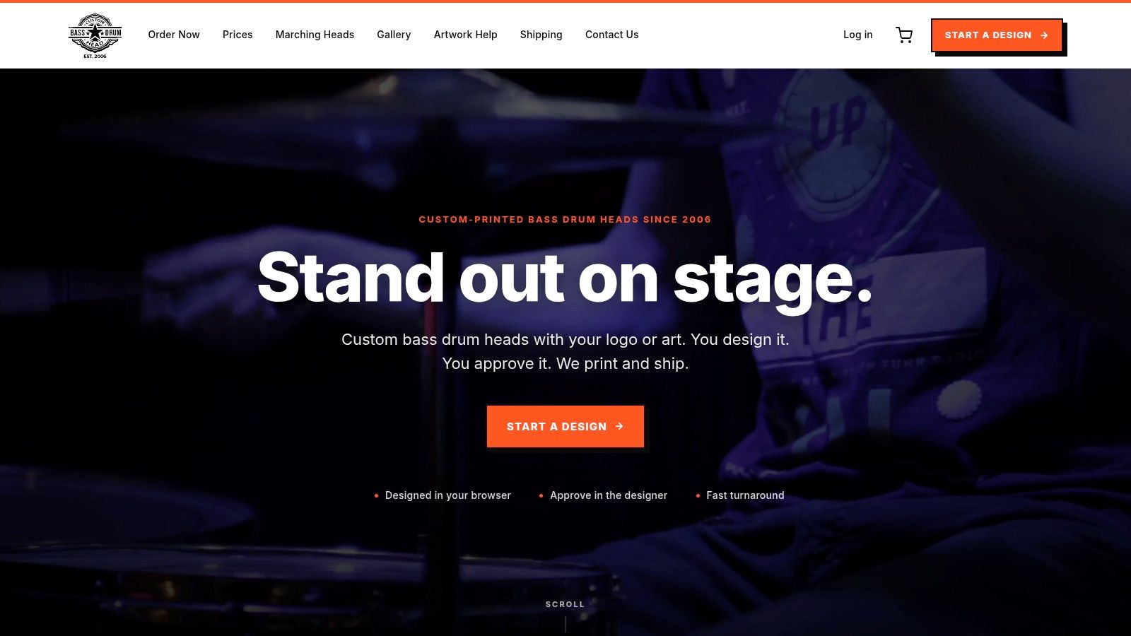
A typical buyer uploads the artwork, chooses the head type, picks the drum size, and then sees the mockup. That first preview usually answers one question immediately. The design either looks like a real bass drum head or it suddenly feels too small, too crowded, or off-center.
The mockup is where professionals slow down
The modern ordering process is fast, but this is not the moment to rush. The custom drum head industry standardizes on sizes from 16 to 32 inches and offers mic port placement in four positions: left, right, high, and low, with most orders shipping within a few business days and worldwide delivery available. Those details affect both appearance and stage logistics.
A drummer ordering for a live rig might love a centered lower logo tail in the first preview, then realize the planned mic port will cut right through it. That’s exactly the kind of issue a mockup should catch before approval.
A closer look at custom bass drum head printing options and sizing helps clarify what should be decided before checkout.
Picking the right mic port location
Mic port placement is partly visual, partly practical. The four standard locations each solve a different setup problem.
- Left works well when the microphone stand and cable path are cleaner on that side of the stage.
- Right can make more sense depending on pedal hardware, stand placement, or front-of-house preference.
- High keeps the lower graphic area more open.
- Low is common when the setup calls for a more traditional lower access point.
There isn’t one universal “best” choice. The right answer depends on how the kick is miked and what part of the artwork must remain intact.
How to proof the final version
The strongest approval process is boring on purpose. It’s a checklist, not a vibe check.
A careful buyer will review:
-
Spelling and punctuation
Band names, album titles, and websites should be checked letter by letter. -
Centering and scale
A logo can be technically centered and still look visually low or high depending on its shape. -
Port interference
No key text or logo detail should sit where the port will be cut. -
Edge safety
Anything important should stay away from the hoop’s hidden area.
Approving a mockup should feel slightly slower than expected. That’s a good sign.
Custom kick drum art rewards patience at this stage. Once the art is locked and printed, the permanent choices are the ones that matter most.
What Separates Pro Quality from a DIY Disaster
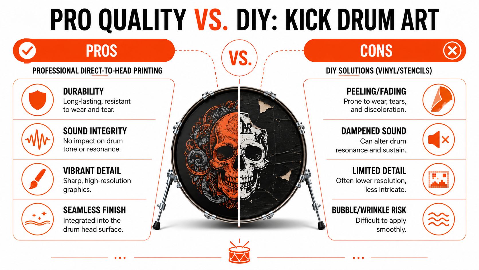
There’s always a temptation to take the shortcut. Cut a vinyl decal. Paint it by hand. Use a stencil and hope the edges come out clean. Sometimes that works well enough for a one-off photo. It rarely holds up like a real printed head.
Why direct printing behaves differently
Professional custom kick drum art uses direct-to-head printing on PET film, which integrates the artwork into the head instead of laying a decal on top. That matters for both looks and function.
According to the direct-print PET drum head process described here, this method eliminates bubbles and peeling common with decals, adds no measurable thickness, and lets the head tune, attack, and resonate like an unprinted stock head, with drummers reporting no audible difference.
That’s the line DIY methods can’t really cross. A sticker sits on the surface. A printed head is the surface.
Where DIY usually goes wrong
DIY options fail in a few familiar ways:
| Method | What looks appealing at first | What usually becomes the problem |
|---|---|---|
| Vinyl decal | Clean concept, easy to order or cut | Bubbles, edge lift, peeling over time |
| Stencil and marker | Cheap and fast | Mistakes are hard to fix and edges can look rough |
| Layered adhesive graphics | Can mimic a bold logo | Added surface material can change feel and finish |
The visual issues are obvious enough. Air pockets, wrinkles, and lifting corners all show under stage lights. The acoustic issue matters just as much. Players don’t want the front head to become a compromise just because it looks cool from ten feet away.
Why pro results feel more finished
There’s also a difference in predictability. Professional workflows usually include a production check or live mockup that matches the finished result. DIY work doesn’t. The final look often depends on hand placement, alignment luck, and whether the material settles cleanly on the first try.
The most expensive custom head is often the cheap DIY version that has to be replaced before the next important show.
That’s why professionally printed custom kick drum art tends to be the better buy for active bands, schools, worship teams, and anyone who needs a repeatable result. It looks cleaner, lasts better, and avoids turning the bass drum head into a design experiment.
Designing for the Stage Will Your Art Be Seen
The screen lies. It makes everything look bigger, brighter, and more detailed than it will appear from the audience.
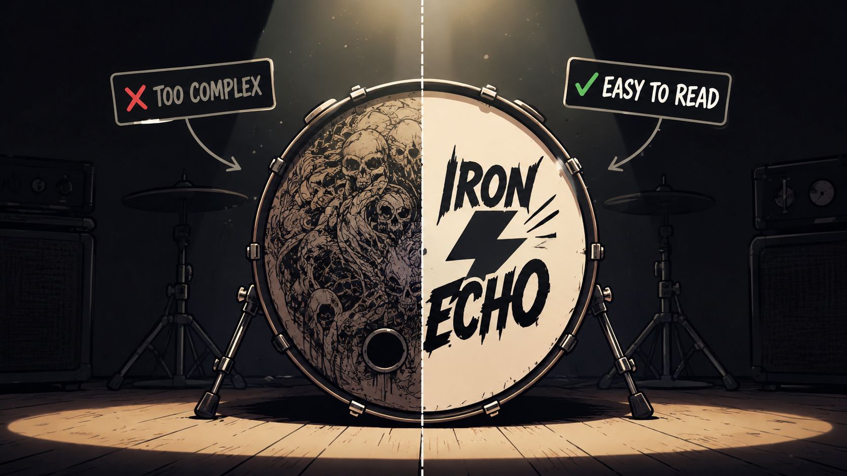
A design can be gorgeous at arm’s length and nearly useless once the lights go down. That’s one of the biggest gaps in most advice around custom kick drum art. People talk about style, not visibility.
Complex doesn’t mean effective
A common pitfall is relying on intricate logos, thin lines, and decorative detail that disappear under normal stage conditions. The clearest practical guidance appears in this stage-visibility advice for custom bass drum heads, which notes that fine-line art often becomes unreadable from the audience and that high contrast, one clear focal point, and limited detail work best because “fine textures and tiny decorative elements rarely survive distance”.
That observation matters more than many buyers expect. A drum head is not being viewed in a design studio. It’s being seen through haze, colored wash, glare, motion, and imperfect sightlines.
A simple test for stage-readiness
A useful standard is the five-second read. If someone sees the kit for a few seconds, what do they take away?
- The band name
- A memorable symbol
- A clean shape and color identity
- Nothing, because the design is too busy
That last result happens all the time. The artwork isn’t bad. It just isn’t built for distance.
For large ensemble and branding-focused setups, drumline bass drum head design ideas are a good reminder that strong visibility nearly always beats intricate decoration.
What tends to work on stage
The safest choices aren’t always the most exciting on a laptop, but they win in a venue:
- High contrast backgrounds and foregrounds
- One dominant focal point
- Bold text over delicate script
- Limited supporting detail
- Clear separation between logo and background
If the audience has to study the kick drum to understand it, the design is doing too much.
Custom kick drum art should still look good up close. But stage art earns its keep at a distance. The crowd doesn’t need every detail. It needs one clear visual message that lands immediately.
Installation and Care for Your New Drum Head
The good news is that installing a custom head doesn’t require special treatment. It goes on like any other bass drum head.
Install it like a normal head
A straightforward install keeps everything clean:
- Remove the old head carefully so hardware doesn’t scrape the printed surface during setup.
- Seat the new head evenly before tightening.
- Tension in stages rather than cranking one rod all the way down first.
- Check the logo orientation before final tightening so the artwork sits exactly where it should.
Tuning shouldn’t feel mysterious. The printed head is still meant to be tuned for the sound the drummer wants. There’s no alternate method required just because the surface carries artwork.
Keep the print looking sharp
Cleaning should stay simple. A soft cloth and gentle wiping are usually enough for dust, fingerprints, and normal handling marks. Harsh scrubbing and aggressive chemicals are where problems begin.
A few habits help preserve the finish:
- Wipe after transport if road dust or grime built up during load-in
- Avoid abrasive pads that can scuff the surface
- Store the kit thoughtfully so hard edges from stands or cases don’t rub the printed head
- Inspect during head changes and normal maintenance
Players who aren’t sure whether the current head is still worth keeping should review when to replace a bass drum head before swapping in a new custom piece.
A custom bass drum head is still a working part of the kit, not a fragile display object. Install it carefully, tune it normally, clean it gently, and it’ll keep doing its job while giving the kit a much stronger visual identity.
A strong design deserves a clean print, an accurate mockup, and a result that looks right on stage. Custom Bass Drum Head makes it easy to upload artwork, preview the final look in the browser, choose the right size and mic port placement, and order a custom head built for real performance use.