
Late spring is when a lot of band programs realize the visual package still has one unfinished piece. The show music is chosen. Uniform decisions are in motion. Front ensemble carts, props, and banners are getting attention. Then the bass line rolls onto the field with blank resonant heads, and the whole look feels less intentional than it should.
That's why strong marching band drum head design ideas matter. A custom head isn't just decoration. It's one of the few visual elements that sits at eye level on the field, moves with the battery, and gets seen from the sideline, the home stands, and the press box. When it's designed well, it reinforces school identity and makes the entire line look finished. When it's designed poorly, even expensive artwork can disappear at competition distance.
Beyond the Beat Visualizing Your Marching Band's Identity
A marching band's identity rarely lives in just one place. It shows up in the uniform trim, the prop colors, the front ensemble setup, and the way the battery presents as a unit. Bass drum heads belong in that same conversation. They carry the school's name, mascot, or show aesthetic in a place the audience can register during performance.
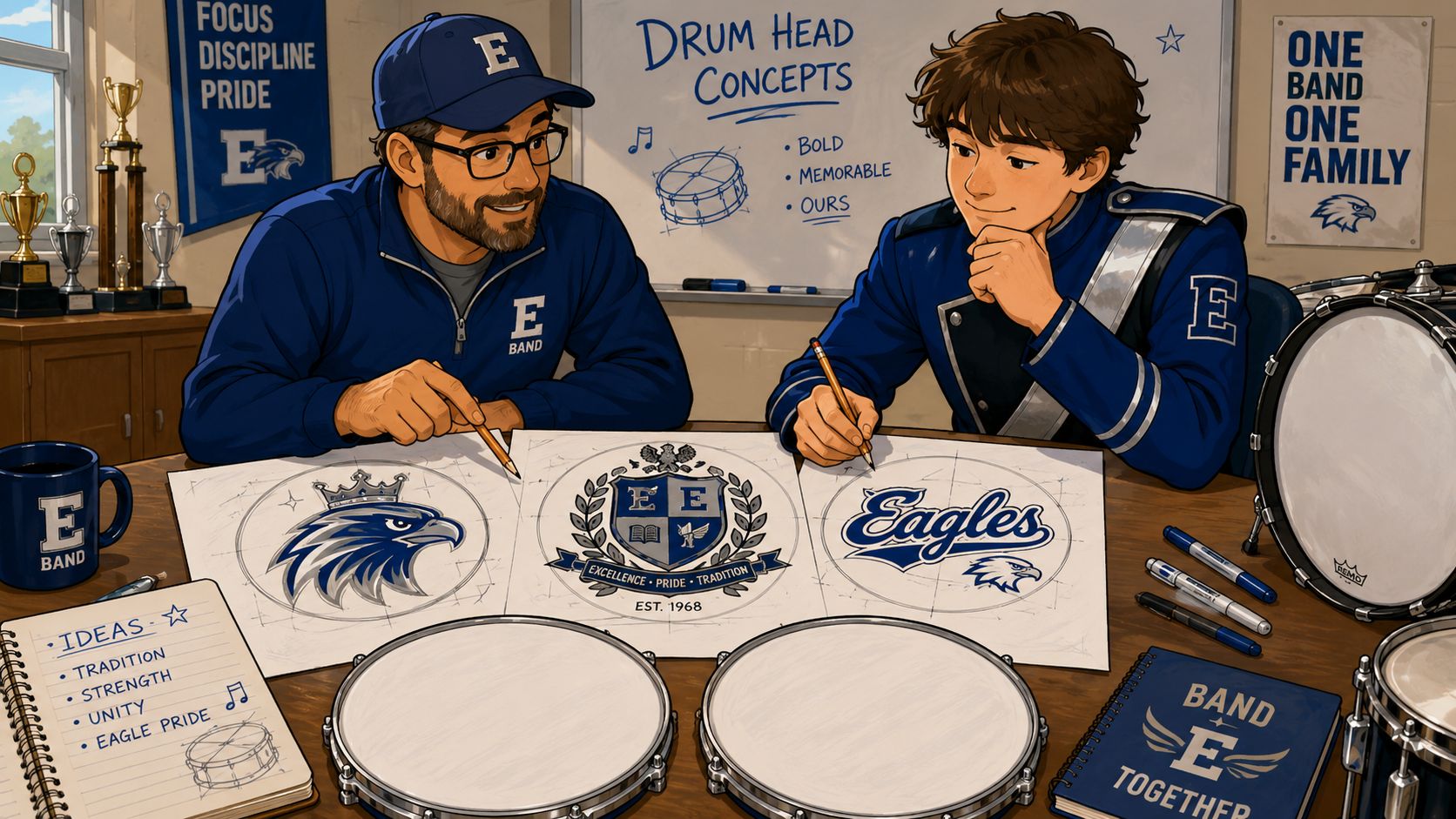
Treat the drum head like part of the show design
The strongest custom marching bass drum head concepts usually start with a simple question. What should the audience remember when the line turns front and those drums face the stands?
Sometimes the answer is pure school pride. Sometimes it's a competition-season theme. Sometimes it's a cleaner, more professional version of branding the program already uses on banners, social graphics, and printed materials. Looking through a custom bass drum head gallery often helps directors and section leaders see that the head can function as a central visual element, not just a place to drop a logo.
Practical rule: If the design wouldn't make sense on a banner, podium sign, or show shirt, it probably isn't focused enough for a marching band bass drum head either.
This tradition is older than most programs realize
Visual identity on marching drums didn't start with digital printing. Pipe bands were painting town and group names on calfskin heads more than 100 years ago, which established a long tradition of using drum heads to communicate ensemble identity (historical reference).
What changed is the process. Modern drum head design became far more practical once synthetic materials replaced animal skin in the 1950s. By early 1957, the first successful plastic drumhead design had been developed, and that shift made marching applications more durable and less weather-sensitive than calfskin heads (drumhead history).
That matters for schools. A resonant head that can carry a printed design and hold up outdoors gives the battery a repeatable, professional look through rehearsals, games, and competitions.
Why this decision has more impact than it seems
A blank bass line can sound excellent and still look unfinished. A coordinated line with a clear visual identity feels like a complete program.
Three questions usually sharpen the direction fast:
- What's the main brand signal? School name, initials, mascot, crest, or show concept.
- Where will the heads be judged visually? Sideline, lower stands, or high press box.
- Is the design meant to last all season? A single all-purpose look often needs broader appeal than a one-show concept.
That's a major shift in mindset. The goal isn't just getting a drum skin graphic printed. The goal is designing a field-facing visual statement that belongs with the rest of the ensemble.
Core Design Concepts for Marching Bass Drum Heads
Most successful marching band bass drum heads fall into a handful of design directions. The styles differ, but the strongest versions all do the same thing. They communicate one idea quickly.
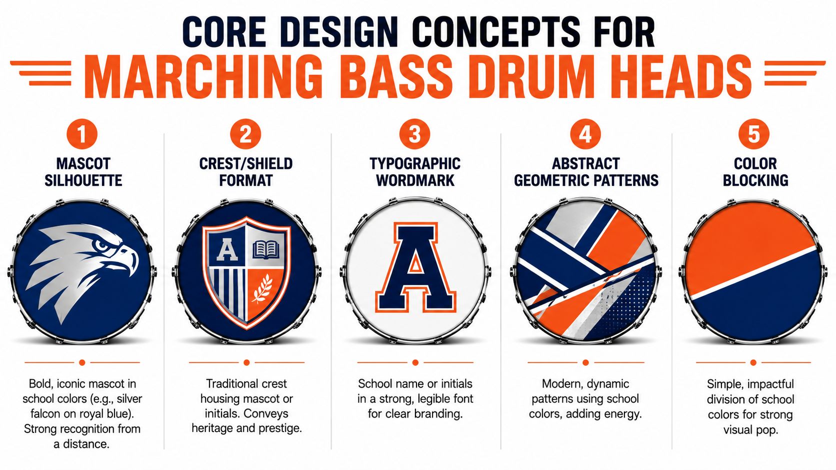
Five design styles that consistently work
Here are the categories that tend to translate best to bass drum head graphics for school programs:
- Color blocking works when the school palette is already strong. Two bold fields of color, a diagonal split, or a centered band across the head can look modern and clean without needing much artwork.
- Mascot silhouettes are dependable for field visibility. A hawk, falcon, wildcat, knight, or lion reduced to a bold shape often reads better than a detailed illustration.
- Crest or shield layouts give a more formal, established look. They fit programs that want tradition, heritage, or an academic identity rather than a purely aggressive sports look.
- Typographic wordmarks put the school name front and center. These can be especially effective when the band wants unmistakable branding from the stands.
- Abstract geometric patterns fit contemporary shows well. Angled shapes, layered bands, and repeating forms can connect the drums to props, guard costumes, or front ensemble visuals.
For programs exploring custom printed marching drum heads, these categories usually narrow choices faster than asking everyone to invent something from scratch.
A falcon, royal blue, and silver
Consider a specific program. The school mascot is a falcon. The color palette is royal blue and silver. The line is deciding between three looks.
| Option | What it looks like | Strength | Trade-off |
|---|---|---|---|
| Full-head falcon graphic | A large illustrated falcon across the entire head on black | Dramatic, aggressive, photo-quality artwork has immediate impact | Fine feather detail can get lost at distance if the values are too close |
| Centered crest on deep navy | A shield with falcon icon and initials centered on the head | Formal, timeless, easy to coordinate with uniforms | Less theatrical than a full illustration |
| Bold silver school wordmark | School name in large type with a thin border | Extremely clear branding from the stands | Minimalist approach depends on typography being strong enough to carry the design |
A full-head mascot can be excellent when the artwork has strong value separation and simplified shapes. A crest is usually safer for all-purpose seasonal use because it feels official and ages well. A wordmark often wins when readability matters more than illustration.
More detail isn't automatically better. A design can look impressive on a laptop screen and still collapse into visual noise during halftime.
Keep one focal point
Overcrowding is one of the easiest ways to weaken a good concept. A single focal element increases logo recognition by 45% during performance, and 68% of high-performing marching lines use shared, consistent designs across the battery. Those numbers come from the verified design guidance in the brief.
That's why the best marching band drum head design ideas usually resist the urge to add everything at once. School initials, mascot, founding date, slogan, city name, and multiple outlines on one head rarely improve the result.
Full-color printing changes what's possible
Today's printing options can reproduce full photographic quality artwork, including mascot illustrations and gradient color schemes. That opens the door to richer visuals than older one-color or hand-painted approaches allowed.
Still, capability shouldn't drive the concept. Just because a head can hold a detailed falcon illustration doesn't mean the design should depend on tiny feather lines or subtle low-contrast shading. For a marching line, the best artwork balances richness with fast readability.
Creating a Unified Look Across the Entire Battery
A single strong bass drum head is good. A full battery that looks coordinated across every size is what makes the line feel polished.
Most marching programs have multiple bass drum diameters, and that's where many otherwise solid designs start to drift. If one head is scaled casually from another, the logo can sit too high on one drum, feel cramped on another, or lose its visual weight across the line. Ordering a matched design set across all bass drum sizes in the battery solves that problem by keeping the design language consistent while adjusting scale to each actual drum.
What visual cohesion actually looks like
A unified battery doesn't mean every surface has to be identical. It means the design system feels intentional.
That often looks like this:
- Bass drums: Shared core design with the same mascot, crest, or wordmark scaled for each size.
- Snare heads: Smaller marks, monograms, or subtle visual echoes rather than full graphics.
- Pit equipment: Coordinated panels, skirts, or front-facing graphics using the same palette and shape language.
- Uniform color decisions: Head backgrounds and border treatments that support, not fight, the fabric colors and trim.
A good set of marching band bass drum heads acts like the anchor. It gives the percussion section one visual center that the rest of the package can follow.
Shared design or individualized line
There's a reason shared layouts dominate strong visual programs. A consistent set reads as one ensemble, not five separate objects.
The practical workflow is simple:
- Choose one base concept.
- Decide what must stay fixed, such as mascot shape, border treatment, and palette.
- Adjust only what needs to adapt to diameter, such as scale and placement.
- Keep secondary details minimal.
The result is cleaner and easier to approve than trying to make each drum completely different. That's especially true for programs balancing creativity with budget and staff time.
A bass line should look related at a glance. If viewers have to study each drum to understand the set, the design system is working too hard.
Coordinate beyond the bass line
The battery rarely performs in isolation. That's why the design should also support nearby visual elements.
A quick coordination check helps:
| Element | Best coordination move |
|---|---|
| Snare and tenor surfaces | Repeat a symbol, trim shape, or accent color without clutter |
| Pit equipment fronts | Use the same background tone or angular pattern family |
| Uniforms | Match dominant field colors, not every small accent |
| Props and backdrops | Borrow one motif rather than duplicating the full bass design |
For directors planning custom bass drum heads for marching bands, these designs ensure the drum line stops feeling like an add-on and starts looking integrated with the entire show.
Designing for Readability from the Press Box
The biggest mistake in marching band drum head design is assuming the best-looking mockup will also be the best-looking field result. It won't.
A lot of designs look sharp on a phone screen because the viewer is inches away. Judges, parents, and crowd members usually aren't. They're seeing the head from the sideline, the stands, or high above the field under uneven stadium lighting. That changes everything about what reads.
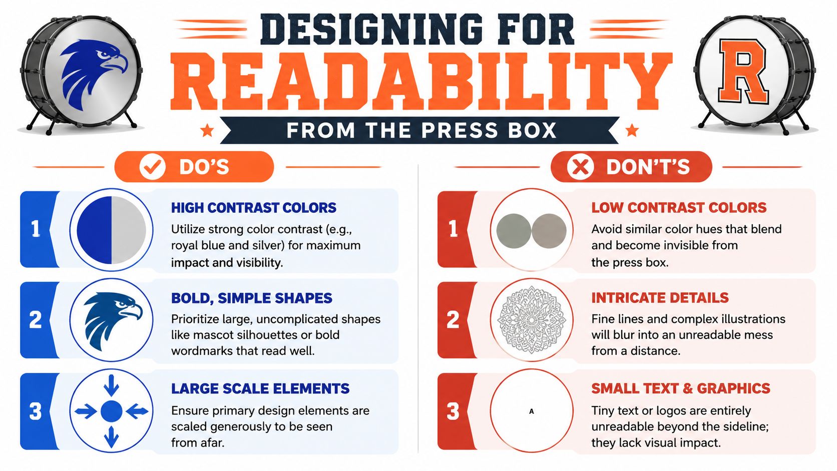
The press box test
A useful test is simple. If the core idea can't be understood quickly from far away, it needs revision.
That's why one of the most important gaps in design advice is on-field readability. Many custom platforms let users upload images, logos, and text, but they don't explain that low-contrast palettes or fine-line art become illegible at marching performance distances. The safer approach is simpler shapes and stronger contrast so the design still works from the stands.
What reads from distance and what disappears
The difference usually comes down to three variables.
Contrast
Royal blue against silver can work very well. Medium gray on slightly lighter gray usually won't. A dark background with a bright focal shape tends to hold up better than two mid-tone colors that blend together.
The falcon example offers a practical illustration. A silver falcon on deep navy will usually read more cleanly than a detailed dark falcon on black, even if the black version looks moodier up close.
Shape simplicity
Large silhouettes, block lettering, and clean crests survive distance. Intricate feathers, distressed textures, and thin internal linework often don't.
That doesn't mean illustration is off limits. It means the illustration has to be designed with bold masses and clear edges. Full photographic quality printing can reproduce gradients beautifully, but the overall image still needs a readable silhouette.
Scale
The primary element needs room. If the mascot or wordmark occupies too little of the printable area, the audience loses it quickly.
A useful way to think about it is hierarchy:
- Primary element: The one thing the audience should notice first.
- Secondary support: Border, shadow shape, or simple background treatment.
- Optional tertiary detail: Only if it still reads as secondary from distance.
Sideline view versus press box view
These are not the same design problem.
From the sideline, viewers can appreciate more nuance. They'll notice subtle gradients, border treatments, and texture in the artwork. From the press box, they mostly register shape, contrast, and placement.
That's why a centered crest often performs well across both viewpoints. It gives sideline viewers some structure and detail while preserving a simple read from above. A large wordmark can be even stronger if the school name is the message that matters most.
For teams refining logos or marks before moving to final drum art, Custom Bass Drum Head's logo guide is a useful planning reference.
If the design only works up close, it isn't a field design. It's a poster.
Plan for the port hole before finalizing artwork
This is one detail directors often leave too late. If the resonant head needs a mic port, that opening shouldn't cut awkwardly through the falcon's eye, the center of a shield, or the middle of the school name.
A few clean solutions work well:
- Offset the focal point slightly and reserve one lower quadrant for the port.
- Use a border or banded layout so the port lands in negative space.
- Place the wordmark higher if the lower portion needs to remain clear.
The cleanest designs treat the port as part of the composition, not as damage done after the fact.
From Digital File to On-Field Reality
Good design decisions can still fail during ordering if the production details aren't handled carefully. Most problems don't start with the mascot choice. They start with sizing, proofing, and timing.
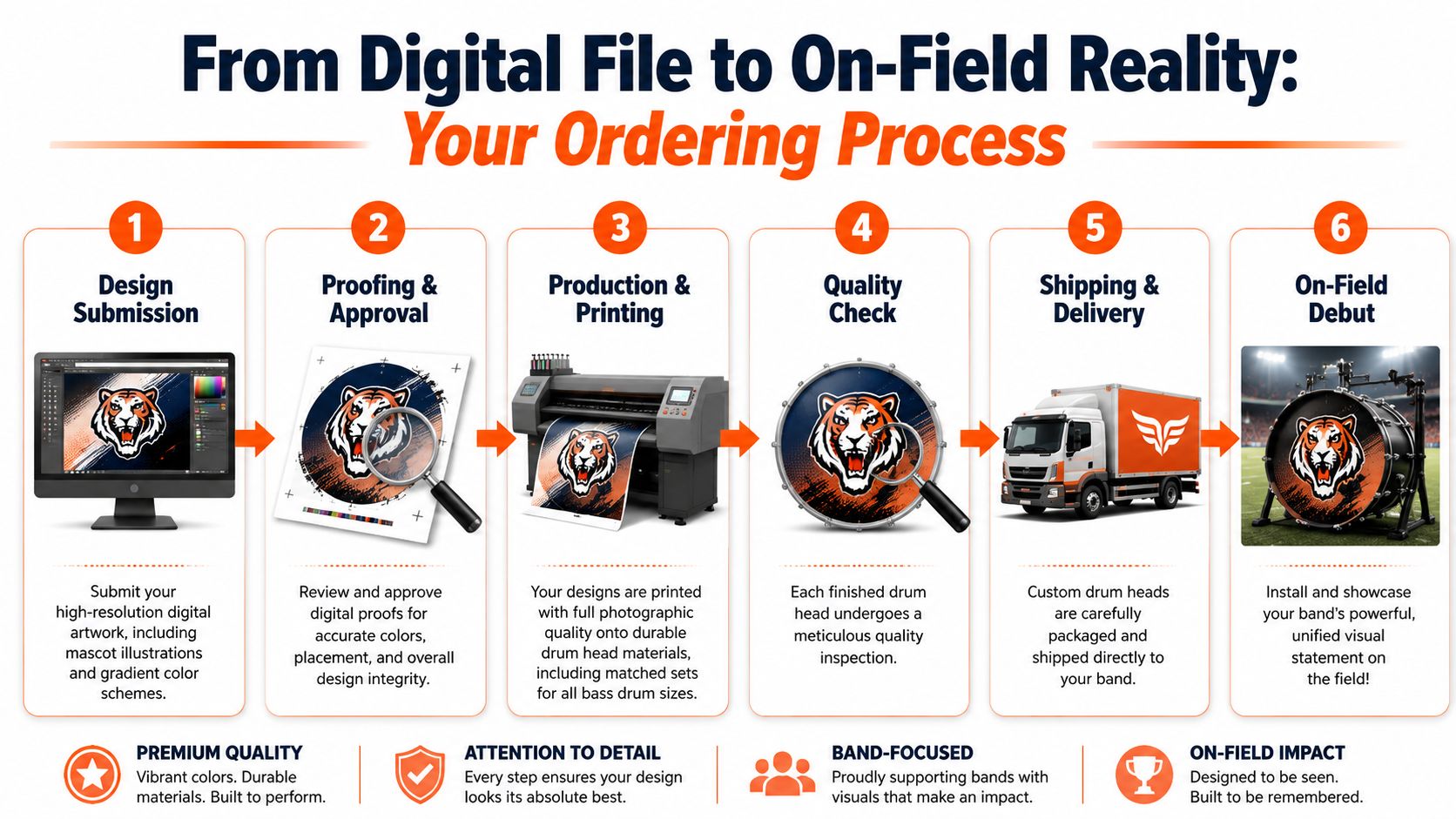
Start earlier than feels necessary
For a school program, the safest planning window is before band camp pressure hits. That gives staff time to confirm branding, collect files, approve proofs, and handle any corrections without compressing the calendar.
This is also where the season decision matters. Some programs want one clean head used all season. Others consider rotating designs for special events or a themed competition look. Most directors are better served by one strong, versatile design unless there's a clear reason to create multiple versions.
Prep the art correctly
The artwork phase should be treated like a real production handoff, not an informal screenshot exchange.
Use:
- High-resolution files such as JPG, PNG, SVG, PDF, or vector artwork.
- A locked color direction so silver, navy, black, and white aren't shifting from draft to draft.
- A proof review step that checks placement, scale, and any port-hole decision before approval.
Verified guidance in the brief states that 30% of orders require post-proof adjustments due to unverified scale or color mismatch, which is why proof review can't be rushed.
For directors who want a fuller walkthrough of artwork and printing for drum heads, it helps to think of the process as design submission, proofing, production, and installation rather than a single upload step.
Measure the drum correctly
This is the step that causes the most preventable problems. 22% of custom head order failures are due to measurement inaccuracies, and the most common mistake is assuming the drum sizes follow a predictable progression from an old list instead of measuring each drum individually. Even a 2mm variance can shift a logo noticeably off-center.
The correct measurement is the shell's playable diameter edge-to-edge, not the outer hardware span. Using the wrong reference can create a 3 to 5mm error, which leads to graphic misalignment. Verified guidance also notes that success rates exceed 95% when each drum is individually verified, while failure rates can climb to 40% when assumptions are used.
Measure every drum in the line. Don't trust the spreadsheet, and don't trust that one size automatically predicts the next.
A simple ordering checklist
Before final approval, make sure the program has answered these questions:
- Is the concept final? No unresolved debate between mascot, crest, or wordmark.
- Are the files production-ready? Clean art, not screenshots from a website or yearbook PDF.
- Has each drum been measured individually? Every shell, edge to edge.
- Has the proof been checked at scale? Especially for centering and port placement.
- Is there delivery buffer before first use? Enough time for installation and any correction if needed.
At the point where inspiration has turned into a real purchase decision, it makes sense to learn more about ordering custom marching bass drum heads and confirm what's needed for your specific line. Programs ready to move straight to product options can also go directly to the custom bass drum heads page.
Unifying Your Sound with a Powerful Visual Statement
A strong battery already projects identity through timing, sound quality, and ensemble presence. The visual side should support that same level of discipline.
The best marching band bass drum head designs don't chase complexity for its own sake. They choose one message, build around field readability, and stay consistent across the line. That's what makes a royal blue and silver falcon program feel sharp whether it chooses a bold mascot silhouette, a centered crest, or a clean silver wordmark. Different styles can all work. The ones that win are the ones that stay legible and intentional.
What good programs get right
They usually make four smart choices:
- They design for distance first. Press box readability matters more than close-up novelty.
- They keep the battery coordinated. A matched set looks organized and professional.
- They use production-ready artwork. Full-color, photo-quality printing works best when the source files are clean.
- They handle logistics early. Measuring, proofing, and ordering on time prevents avoidable mistakes.

The visual package is part of performance
Marching audiences don't separate sound from presentation. They experience the whole ensemble at once. When the bass line carries clear, well-scaled drum skin graphics, the program looks more complete before a single note is judged.
That's why custom marching bass drum heads are worth taking seriously. They're not extra decoration. They're a visible part of the ensemble's identity, and they can either sharpen the show or dilute it.
The line already works hard to sound unified. The heads should help it look unified too.
A great marching design balances school pride, field readability, and clean execution. When your program is ready to turn mascot art, wordmarks, gradients, or a full matched battery concept into durable printed heads, Custom Bass Drum Head makes it easy to create and order a professional look that's built for the field.