
A bass line can play clean and still look unfinished. Staff usually notice it at the worst moment: warmup is done, the line is staged near the gate, and the heads that looked fine on a laptop suddenly read as five separate design decisions instead of one coordinated visual statement.
That problem usually starts with a simple ordering mistake. Someone uses the same centered graphic file on every shell size, assumes the printer will “make it fit,” and ends up with a smallest drum that looks crowded and a biggest drum that looks empty. For a competitive line, that’s an avoidable visual miss. A custom drumline bass drum head set has to be treated like a matched package, not five isolated prints.
The Unforced Error on the 50-Yard Line
A corps tech walks the bass line before a regional and stops at bass 1. The logo fills too much of the head. The outer shape sits too close to the rim, the negative space is gone, and the design feels cramped before the line even moves.
Then the tech gets to the biggest drum and sees the opposite problem. The same logo, printed at the same pixel dimensions, now feels undersized and disconnected from the shell. Instead of one visual identity across the arc, the line looks like it borrowed heads from different orders.
What goes wrong
A drum corps bass drum head order falls apart visually when artwork is treated as a fixed object instead of a proportional one. Centering the same file on a 24-inch head and a 16-inch head doesn’t create consistency. It creates distortion in how the audience reads size, balance, and hierarchy.
The issue gets worse with designs that include:
- Thick borders that suddenly dominate the smallest drum
- Mascot faces or crests that lose breathing room on tighter diameters
- Wordmarks with taglines that become too dense on upper basses
- Background textures that look subtle on larger heads but muddy on smaller ones
A matched bass line should read like one decision from the stands, not five separate uploads.
Why experienced staffs still get burned
This isn’t a beginner mistake. It happens when a staff handles custom heads late in the process, usually after uniforms, floor, props, and drill labels have already taken the attention. The head art gets approved fast because each mockup looks acceptable on its own.
That’s the trap. Individually acceptable heads can still fail as a set.
For buyers actively planning a custom marching bass drum heads order, the main job isn’t just choosing the artwork. It’s controlling how the artwork scales across the full line so the section keeps its field identity from bass 1 to bass 5. That’s where the order either looks professional or rushed.
Why Visual Cohesion Wins General Effect Points
A bass line sits in one of the most visible real estate zones in the battery. Those heads face front, move with the ensemble, and carry a lot of visual weight from the sideline and the box. When the design language is clean and proportional, the section supports the show package. When it isn’t, the eye catches the inconsistency immediately.

A coordinated set of marching drum heads doesn’t just make the line look cleaner in lot photos. It strengthens the impression that the percussion staff made intentional visual choices, and that matters when every part of the field presentation is being read as one package.
What judges and audiences actually see
Nobody in the stands studies the print file. They read shape, contrast, and consistency at distance. A bass line with matched proportions feels tighter, more disciplined, and more integrated into the production.
That visual read comes from details such as:
- Shared scale logic across the line, so each head carries the same visual weight
- Stable focal points that don’t drift awkwardly as shell diameter changes
- Consistent margins between the artwork and the edge of the head
- Clear hierarchy so the primary symbol or wordmark lands first
Cohesion makes the whole battery look more finished
Visual cohesion works because the audience processes the line as a single block before they process individual players. If the heads form one strong image system, the section reads as unified even during fast transitions and changing forms.
A mismatched set does the opposite. It introduces noise.
Practical rule: If the design ratio changes from drum to drum, the eye notices the error even when the viewer can’t explain it.
There’s also a branding layer that staff sometimes underestimate. A drumline bass drum head is often the most obvious field-facing place to carry the program mark, show concept, or school identity. If that mark looks stretched, crowded, or inconsistent, the visual package loses authority. If it looks coordinated, the ensemble looks more complete before a note is judged.
The Scaling Solution for Multi-Sized Drum Lines
The fix is straightforward, but it has to be deliberate. The artwork should be scaled by drum diameter, not dropped onto each head at the same raw dimensions and centered by habit.
That matters most on a standard five-drum line. If the set includes 16, 18, 20, 22, and 24 inch heads, each drum needs its own layout adjustment so the logo-to-head ratio stays visually consistent across the arc.
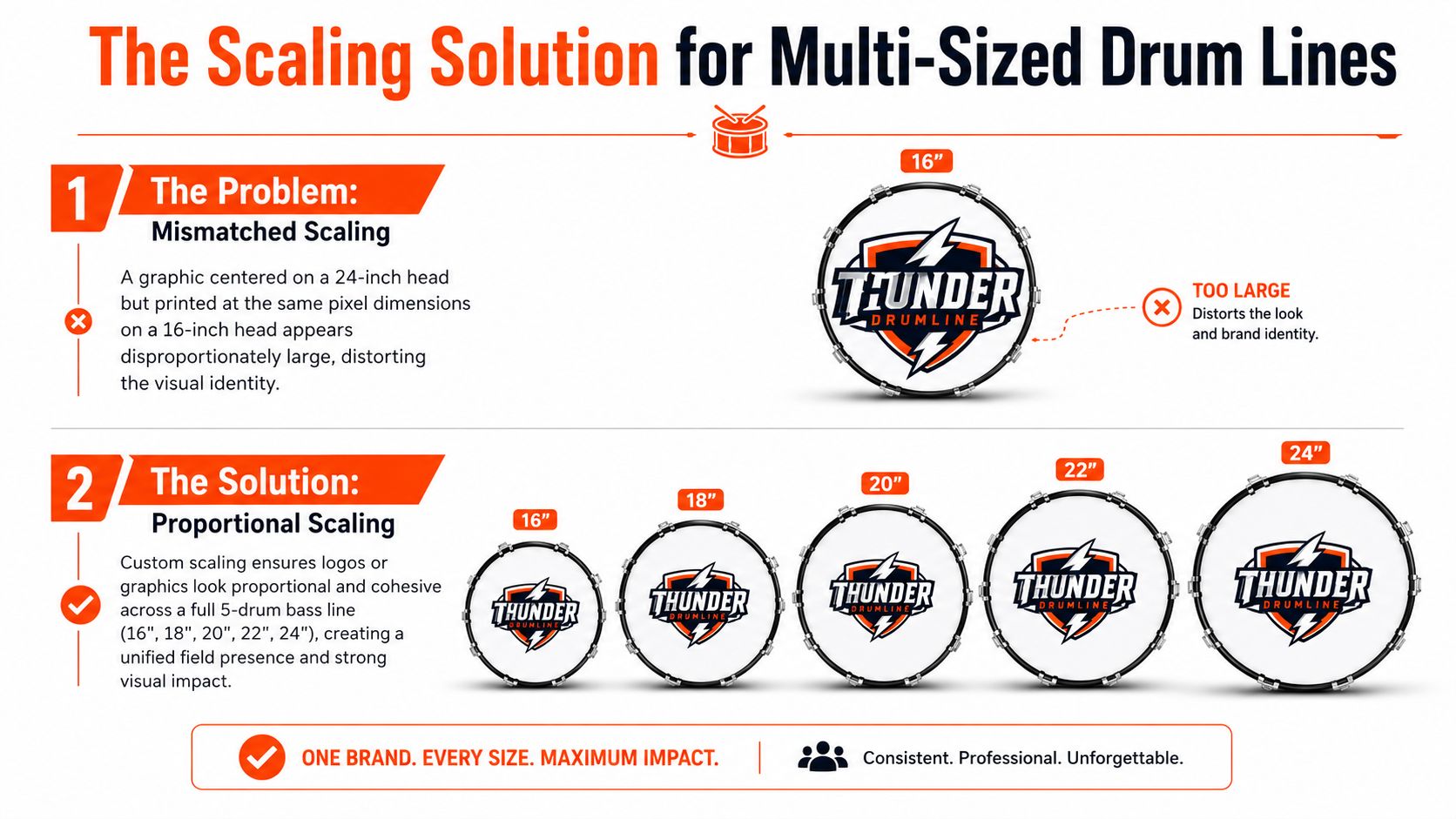
The wrong way
Take a centered crest that looks balanced on a 24-inch head. If that exact same pixel-sized image is printed on a 16-inch head, the crest suddenly eats too much surface area. The border feels thick. Any secondary text gets pushed too close to the collar. The design stops reading as intentional.
The reverse is just as bad. Build the art around the smallest drum and then print it unchanged on the 24-inch head, and the largest shell looks under-designed. The logo floats. The line loses authority at the bottom of the arc, right where the eye expects visual weight.
A quick comparison makes the problem obvious:
| Drum size | Same-pixel artwork result | Properly scaled result |
|---|---|---|
| 16 inch | Crowded, oversized focal point | Clean spacing, readable focal point |
| 18 inch | Slightly heavy | Controlled balance |
| 20 inch | Often acceptable by accident | Consistent with full set |
| 22 inch | Starts to feel small | Correct visual weight |
| 24 inch | Lost in open space | Anchored and proportional |
The right way
A matched set uses the same core design but adjusts the scale for each diameter. The logo, crest, illustration, or wordmark should keep the same relative footprint on every head, even though the absolute print size changes.
That usually means checking:
- Outer margin from the art to the head edge
- Visual weight of lines and shapes on the smallest drum
- Centering and optical balance, which isn’t always geometric center
- Readability of secondary details on upper basses
For buyers who need Custom Bass Drum Head sizing help, the safest approach is to measure every drum individually before final proof approval. Even when the set is nominally standard, the order should be built around the actual head sizes being installed.
How a coordinated order solves it
The strongest custom marching bass drum heads orders are built as one grouped project, not as separate single-head products. That makes it possible to produce matched sets where the same graphic is properly scaled per drum diameter.
One practical option in the market is Custom Bass Drum Head, which allows buyers to upload art and review browser-based mockups before printing. The key benefit in a multi-drum order isn’t just customization. It’s the ability to review each size as part of the same visual system before anything ships.
If the proof is only approved one drum at a time, the line can still end up mismatched.
That proofing step is where proportional scaling stops being a theory and becomes a clean set on the field.
Designing for the Stadium Environment
A design that looks sharp at arm’s length can disappear from the stands. Stadium distance changes everything. So do bright afternoon sun, late-evening stadium lights, and the visual clutter around the field.
That’s why the best drumline head designs usually read with bold contrast first and fine detail second.

Color choices that survive outdoors
Strong outdoor graphics usually rely on clear value separation. Dark background with light mark. Light background with dark mark. One dominant accent color that doesn’t fight the main identity.
Low-contrast combinations often fail in both sun and under-light conditions. Mid-tone on mid-tone might feel refined in a design file, but from the bleachers it tends to flatten out.
Staff planning a show-specific or all-season look should usually favor:
- High-contrast pairings that hold shape from a distance
- One clear focal color instead of several competing accents
- Backgrounds that support the mark, not textured fills that weaken it
- Consistent palette choices across all five drums
Programs looking for ideas that achieve a winning drum line look usually get the best results when they simplify before they decorate.
Simplicity beats cleverness from the press box
A bass head isn’t a poster. It’s a moving field graphic. That changes the design standard.
Fine line work, thin outlines, and layered textures can print beautifully, but they still need enough mass to read at distance. A single strong mascot silhouette, a bold wordmark, or a clean crest often lands better than a highly detailed illustration with several small supporting elements.
From the press box, the audience reads shape first, not detail.
A useful test is to shrink the design on screen until it’s only a small circle. If the main idea disappears, the head probably needs stronger contrast or simpler structure.
Full-color printing still needs discipline
Full-color capability gives staffs more freedom, especially when the art includes gradients, layered branding, or show-themed graphics. But just because a file can include photo-quality detail doesn’t mean every head should.
The best use of full-color printing that holds up through an outdoor marching season is usually controlled, not overloaded. Rich color is valuable when it supports readability. It hurts when it creates visual noise.
For a drum corps bass drum head set, the best field designs usually have one job. Be recognizable fast. If the crowd needs extra time to decode the image, the concept is too busy for the environment.
Ordering Your Marching Bass Drum Heads The Right Way
Most bad custom head orders don’t fail because the art was weak. They fail because the process was loose. Sizes were confirmed too late, files weren’t prepared cleanly, or the proof wasn’t checked as a full set.
A coordinated order works better when the staff handles it like any other production asset. Early calendar check, correct files, visual review, then approval.
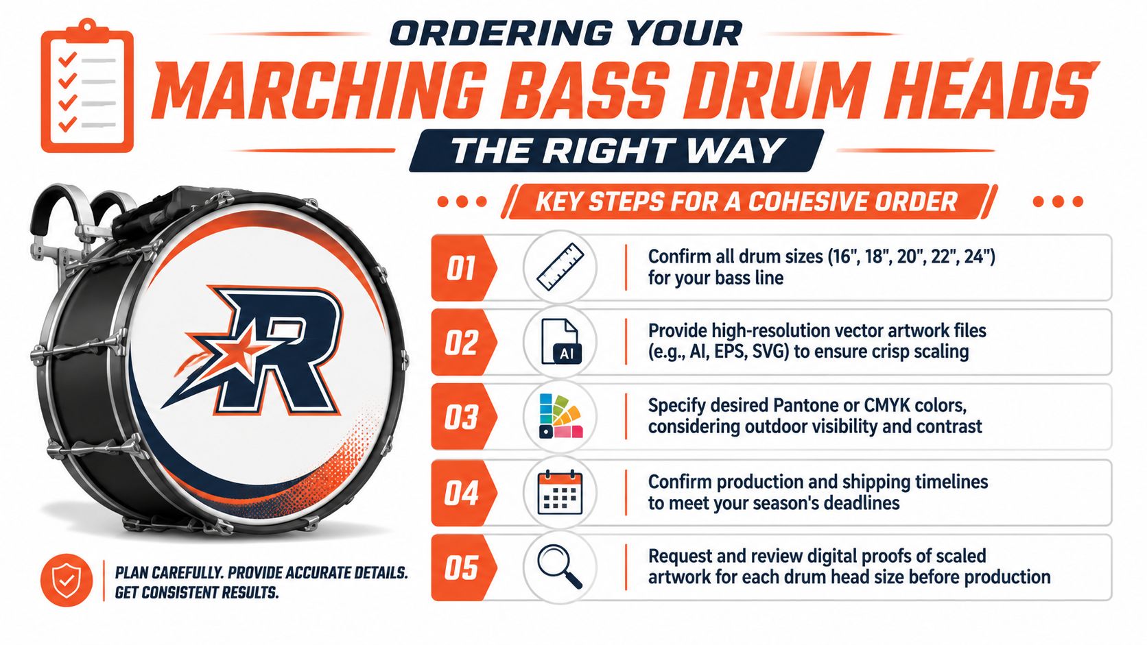
The ordering sequence that prevents headaches
The cleanest workflow usually looks like this:
- Confirm every shell size in the line before any art is finalized.
- Prepare files in production-ready formats such as vector PDF, SVG, AI, EPS, or high-resolution PNG.
- Lock the color direction before proofing starts.
- Review every drum in the set together, not one by one.
- Leave calendar buffer before first camp, tour departure, or regional block.
Staff ready to start can handle that workflow through Custom Bass Drum Head ordering.
File prep that actually prints cleanly
A surprisingly common issue is usable-looking art that isn’t print-ready. Screenshots, copied social graphics, and flattened low-resolution logos often fall apart when they’re enlarged or resized across several diameters.
The safest files for custom marching bass drum heads are:
- Vector files for logos, wordmarks, badges, and simple mascot shapes
- High-resolution PNGs when transparency matters
- PDF artwork packages when the design includes multiple linked elements
- One approved color direction instead of several similar versions
Proof the set, not just the art
The proof is where the order is won or lost. Staff should ask to see every drum size in the same review cycle so the line can be judged as one visual block.
That’s also the point to check:
- Logo scale from 16 through 24
- Spacing near the edge of each head
- Any text that may tighten up on smaller drums
- Background elements that might feel too empty on larger drums
Check this before approval: If bass 1 and bass 5 don’t feel like members of the same family at a glance, the set isn’t ready.
Lead times matter too. Corps-style programs tend to bunch seasonal production decisions into the same window. The safest move is to order earlier than feels necessary, especially when the art still needs a revision round or internal approval from design staff, percussion staff, and administration.
Drumline Head FAQs Durability and Logistics
The final questions usually come after the art is approved. Will the print hold up? Will the head still function like a marching head should? What about ports and layout compromises?
Does full-color printing hold up for a season
For a field-facing product, durability matters as much as appearance. Buyers want the visual package to survive repeated handling, weather exposure, truck loading, and normal season wear without turning into a peeling or bubbling mess.
A major reason marching heads are suitable for this environment is the base construction. High-tension marching bass drum heads are engineered with 2-ply uncoated transparent film, typically 10 to 12 mil thickness, to withstand extreme lug tension without stretching or deforming, providing a more prominent attack and consistent tone across repeated performances in harsh outdoor conditions according to this marching bass drum head materials reference.
For buyers comparing print methods, Custom Bass Drum Head’s printing comparison is a useful place to review how direct printing differs from layered approaches.
What about custom artwork durability under marching use
One real gap in the market is the lack of specific guidance on how custom artwork holds up under marching-specific tension choices, especially when lines make setup decisions that differ from standard kit use. That concern comes up often because direct-printed and customized surfaces have to survive a very different use case than a lightly handled display head.
The practical takeaway is simple. Buyers should ask how the artwork is applied, how the proof accounts for the final playable area, and whether the production method avoids extra layers that can introduce edge problems.
Does printing change the function of the head
Buyers usually worry that custom graphics will turn a playable head into a decorative one. The better way to think about it is that the head still needs to be ordered for the intended application first, then printed correctly for that use.
That’s why materials, construction, and fit matter before aesthetics. The print should support the product. It shouldn’t ask the staff to accept a compromised marching head just to get the visual.
What should staff know about mic ports
Port planning matters whenever a custom bass drum head needs to balance artwork and access. Standard mic port sizes are 4 inches, 5 inches, and 6 inches, and 4 inches is the most common choice because it’s large enough to mic through without dominating the artwork design, as noted in this bass drum head port sizing guide.
Port placement should be decided before the art is locked. If the logo, crest, or wordmark is approved first and the port gets added later, the finished head often looks compromised. Build the port into the composition from the start.
A clean bass line deserves heads that read as one system, not five mismatched prints. If the goal is a field-ready set with correctly scaled artwork, durable full-color printing, and a proofing process that catches problems before production, start the order at Custom Bass Drum Head.